

If you've written more than a handful of end-to-end tests, you already know the real maintenance burden isn't writing assertions; it's the selectors underneath them. A redesign ships, a div.cta-primary becomes button[data-cta="primary"], and suddenly a dozen feature files across the suite are broken in a dozen different places.
Webship-js's selector steps exist to fix exactly that problem. Instead of scattering raw CSS or XPath through every scenario, you register a human-readable name once: header, main nav, cta button, and use that name everywhere: to click, to check visibility and focus, and to assert how components sit relative to each other on the page. When the markup changes, you update one registry entry, and every scenario that depends on it keeps passing.
The core idea: name it once, use it everywhere
At the center of this feature is a simple registry pattern. You define a name and a selector:
When I add "breadcrumb" selector for ".breadcrumb" css selector
 And I add "cta button" selector for ".cta .btn-primary" css selector
Then I see visible breadcrumb, cta button
...or register several at once with a data table, which is the idiomatic way to declare a scenario's page vocabulary in a Background:
Given I define css selectors:
  | header  | #header     |
  | nav     | nav.primary |
  | footer  | footer      |
XPath works the same way, registered into a separate but equally-resolvable namespace:
When I add "login link" selector for "//a[contains(normalize-space(.),'Login')]" xpath selector
Then I see visible login link
When I click login link
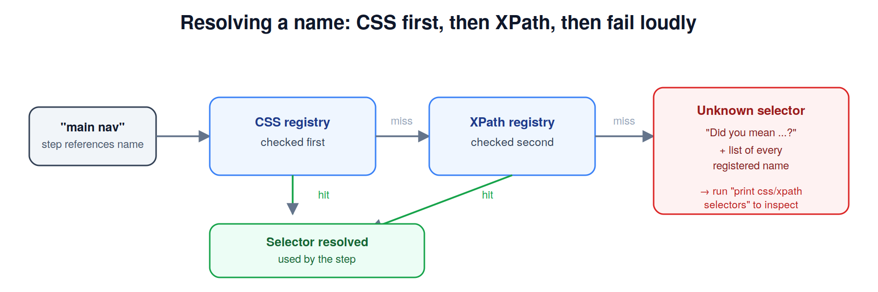
Names are resolved against the CSS registry first, then XPath. If you reference a name that was never registered, Webship-js doesn't just fail; it fails helpfully, offering a "Did you mean ...?" suggestion along with the full list of registered names. Pair that with Then I print css selectors, and Then I print xpath selectors, and debugging an unknown-selector failure becomes a quick console check instead of a hunt through feature files.
Selectors from four sources, merged in order
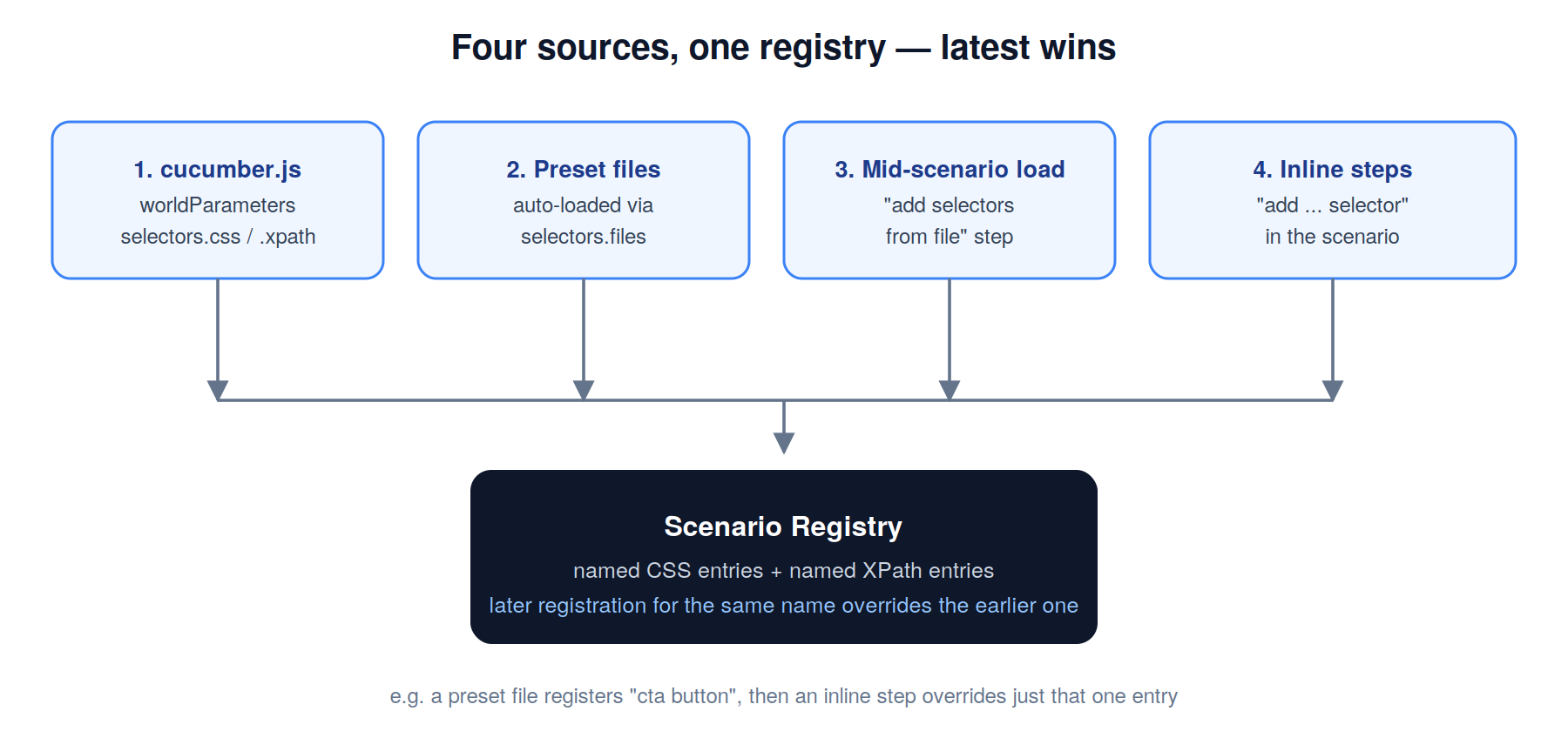
You're not limited to inline registration. Webship-js merges selectors from four places, in this order, with the latest registration always winning:
- The
selectors.css/selectors.xpathblocks incucumber.jsworldParameters - JSON selector files auto-loaded via
selectors.files - Files loaded mid-scenario with
When I add selectors from "file.json" file - Inline registrations made directly by steps in the scenario
That layering matters in practice: load a broad preset file for your CMS or framework, then patch a single entry inline for a scenario-specific quirk, without touching the shared file.
And you don't have to build those presets from scratch. The project ships more than 20 ready-made selector sets under tests/selectors/, Drupal (Claro and Gin admin themes), WordPress, Joomla, TYPO3, Magento 2, Shopify, Strapi, and popular front-end frameworks like Bootstrap, Tailwind, and Material UI. Point your config at the right file and admin-UI element names work immediately.
selectors: {
  filesPath: './tests/selectors/',
  files: ['front-end-selectors.json', 'back-end-selectors.json'],
  css: {
    'page header': 'header.page-header',
    'main nav': 'nav[role="navigation"]',
  },
  offset: 60,
}
Layout assertions that don't rely on pixel comparisons
Named selectors unlock a set of relative-position assertions that would be painful to write against raw CSS every time. All of them operate on absolute page coordinates via Playwright's boundingBox(), after scrolling the target into view, so they stay accurate no matter where the page happens to be scrolled.
Directional position, above, below, left, right:
Then I see heading above subline, list and footer
 And I see logo to the left of nav
Both sides of these comparisons accept comma-and-and-separated lists, and every subject is checked against every target, so a single line can run a full cartesian product of checks and report every failure at once.
Containment, one element fully inside or fully around another:
Then I see logo inside of header
 And I see page outside of content
Overlap and stacking, combining bounding-box intersection with computed z-index, which is exactly what you need for modals, dropdowns, tooltips, and sticky headers:
Then I see modal over content
 And I see nav not over sidebar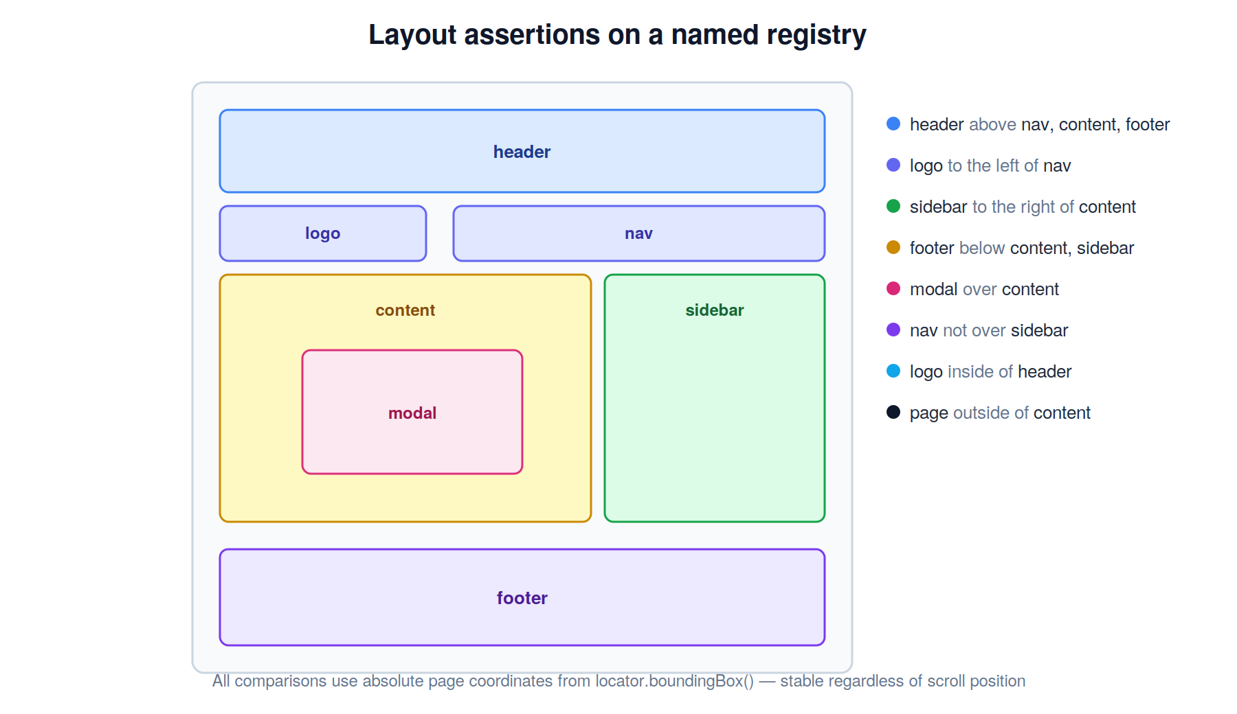
Visibility and focus, using Playwright's auto-retrying waitFor (5-second timeout by default):
Then I see visible hero, content and sidebar
 And I don't see modal, overlay and popup
Then I see search has focus
Responsive checks without hardcoding viewport sizes
Layout bugs are frequently viewport-specific, so the selector steps include named breakpoints you can drop straight into a scenario:
Given I am viewing the site on a xs screen
 Then I see visible heading
Given we are viewing the site on a "xxl" device
 Then I see heading above list
Seven breakpoints ship out of the box, from xs (375×667, phone portrait) up to xxxl (1920×1080, full HD), and you can define your own under worldParameters.selectors.breakpoints if your design system uses different cutoffs. Combine a breakpoint resize with a position assertion and you've locked down a responsive layout in two lines.
Form focus and text selection, resolved the accessible way
Two more step groups round things out for form-heavy flows. Focus movement and text selection both resolve fields the same accessibility-first way, label, then placeholder, then role=textbox name, then name/id attribute, mirroring how a real user or assistive technology would find the field:
When I move focus to "Email" field
 Then I see email input has focus

And I fill in "Title" with "Release 2.0 notes"
When I select "notes" text in "Title" field
That last group of steps- select all text, select a character range, or select a specific substring- is genuinely useful for testing rich-text editors, inline-rename fields, or any workflow where you need to exercise keyboard-driven replace/delete/copy behavior on existing content.
Putting it together
A realistic scenario combines several of these pieces: a Background that defines the page vocabulary, and scenarios that lean on it for both responsive and layout checks:
Feature: Relative element positioning assertions and advanced selector system.

  Background:
    Given I am on homepage
    And I define css selectors:
      | heading  | h1 |
      | subline  | h3 |
      | list     | ul |

  Scenario: Layout holds on a phone-sized viewport.
    Given I am viewing the site on a xs screen
     Then I see visible heading
      And I see heading above subline, list

  Scenario: Mix file-based, inline CSS, and inline XPath selectors.
    When I add selectors from "homepage-selectors.json" file
     And I add "first para" selector for "//p[1]" xpath selector
    Then I see visible page heading, first para
Why this matters
The pitch here isn't "another selector syntax"; it's a maintenance strategy. Raw selectors baked into feature files couple your tests directly to markup, which is exactly the part of a front end that changes most often during a redesign. A named registry moves that coupling to one place: update tests/selectors/cms-drupal-core-claro.json (or your own file) once, and every scenario that references main nav or cta button keeps working without a single line of Gherkin changing.
Combined with position, visibility, containment, and overlap assertions built directly on top of that registry, Webship-js's selector steps give you a genuinely readable way to catch layout regressions, without resorting to brittle pixel-diff screenshots.